This article explores the background to the burger menu. At first, the emergence of this highly controversial design element is described. Then the differences in use and the resulting advantages and disadvantages are explained. This icon offers a wide variety of possible uses and is a constant source of heated discussions. Another aspect is the user experience of a burger menu. There are several ways to make the interaction with the icon as inviting as possible for the user. Current trends are always changing faster and displaced with new ones in the shortest possible time. The question arises whether and when it makes sense to use this icon as a design element. Maybe we should skip it completely for the benefit of the user. Are there possibly better ways to display a navigation in an app or on a mobile website?
Quick Navigation
- The beginning of the Burger-Menu
- Renaissance of the Burger Icon
- Responsive Web Design and "Mobile First"
- Design element: Burger Icon✨
- Design Barrier: Burger Icon 🚧
- Usability through Animations
- Recognizability for the User
- UX Metrics for the Burger-Menu
- Conversion
- Definition of your Target Group
- Target Group: Silver Surfer
- Tab Bar Navigation
- Conclusion to the Burger Icon
- Last Words
The beginning of the Burger-Menu
Usually the burger menu is shown with three horizontal lines and symbolizes a menu bar. It's not a new design element, as you might think, this menu form exists for almost 40 years now. It was created by the American UX designer Norm Cox in 1981 for the user interface of the Xerox Star (illus. 1). At this point he wasn't thinking of a hamburger.
"Instead, he wanted to visualize a list of options in which each line should correspond to a list entry" this is how Petereit describes it in his article.[1]
It wasn't successful at the time. With the rapid advances in technology, monitors kept getting bigger. The menu was no longer needed since more space was available to attach larger navigations on the website. So the icon fell into oblivion for a while.
Renaissance of the Burger Icon
The icon didn't make its breakthrough until 2010 when it was used by Facebook for its mobile apps. By constantly using this hidden navigation, they taught their users that there is a selection menu behind it. Since then, it has been used more frequently in the field of web design to elegantly solve navigation problems, in special on smartphones - after all the space on a smartphone is very limited. So it makes sense to hide elements behind an icon to make room for the main content.
Responsive Web Design and "Mobile First"
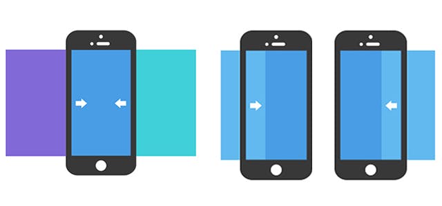
Due to the increasing use of the mobile Internet, designers had to come up with new solutions. Especially websites with extensive information structures demanded new solutions for the display of common patterns on smartphones and tablets. As a result, parts of the user-interface are hidden by default and only displayed when needed. Currently, on many mobile websites, all important navigation elements are either moved to a drop-down menu or hidden Off-Canvas (illus. 2).
This went so far that until a few years ago, desktop versions also used this method because the solution for responsive design is easier and faster to implement. Another approach is mobile first. Websites must now be able to be displayed optimally on mobile devices. Many designers are now following this principle.
OFF-Canvas
The "Off-Canvas" method describes the behavior of a web element. Usually in combination with the navigation menu. This method has a wide range of possible applications such as web apps or normal mobile websites in a responsive design. It describes a certain element that is located outside the viewport and is pushed into the field of view by a user interaction.
Design element: Burger Icon✨
Now the question arises whether using the burger menu on desktop variants makes sense at all. After all, these usually offer enough space to "install" a full-fledged navigation system. Nevertheless, it is often used by designers nowadays, because it brings some advantages. Among other things, that it can be integrated into any design without taking up space from the actual content. Another benefit is for websites where random browsing is the main focus. On sites like Youtube or Pinterest, for example, the navigation doesn't play a major role. For the most part, users use the search function on such pages or scroll through the content of the respective website. The design process of a website is mainly about prioritizing the content elements and guiding the user through the site.
Design Barrier: Burger Icon 🚧
After using and experiencing the Burger Icon, many disadvantages became apparent when using such menus. Various tests by numerous companies have shown that the use of this icon poses many problems. One of the most important key points is the use on the desktop. As the complete navigation disappears under an icon, the user has to overcome another obstacle to get the information he is looking for.
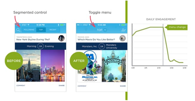
In this example (illus. 3) by Wroblewski L. it can be seen very clearly that after the navigation was changed to a toggle menu, the user interactions have decreased significantly. A large number of users no longer recognized this as navigation between the individual main contents of the app. Consequently, the interactions decreased strongly from this point on.
Usability through Animations
In the early years of the "world wide web", they were mostly animated images (.gif) and were often labeled as annoying. Nowadays animations are an important part of web design and it is hard to imagine to life without them. In general, animations should underline user interaction. There is a fine line between just right and too much. A rough distinction is made between normal and micro animation. The latter should normally not take longer than 0.2 - 0.3 seconds.
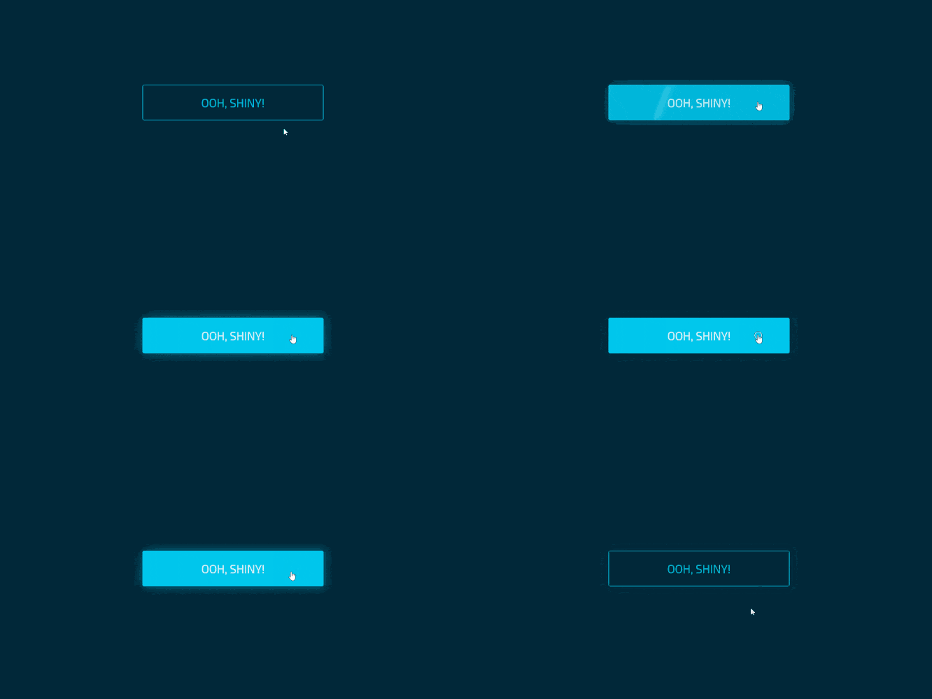
It is important to keep to this exact time, otherwise the user quickly gets the feeling of having to wait. This would have exactly the opposite effect, because micro-animations primarily serve as feedback or a kind of reward for the user. It also works the opposite way. A good example would be if someone enters an incorrect password that a certain element moves back and forth and lights up red. All in all, micro-interactions give the user the feeling of being able to do something. As a result, websites appear less static.

In burger menus, animations can be used to increase the recognizability and the number of clicks. These animations should be integrated into the rest of the design as good as possible. If feasible, you should try to realize animations only in CSS, so that the performance of the page does not deteriorate. Meanwhile there are many properties that can be changed by CSS3. A good example would be the opacity of an element.
Recognizability for the User
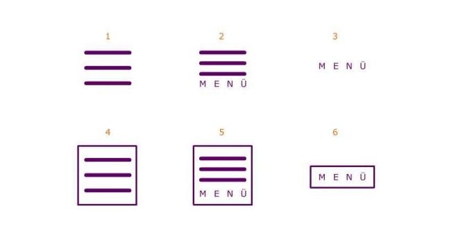
The question of whether the burger icon is recognized by the users, it all depends on where it is used. On the smartphone it usually works very well. It is different on desktop pages. There are different reasons for this. One of them, of course, as described above, is the size of the desktop version. Here it can easily happen that the burger icon is lost in the rest of the content. Another possible reason is understanding. Since such conventions are often applied in apps of smartphones, the user's tolerance is higher there than on desktop pages. Last but not least, it is the design of the icon that differs from side to side. Not all of them are equally well recognized by the users and consequently used. The following graphic (illus. 4) lists the six most common variants.
- burger alone
- burger with label
- label alone
- burger with border
- burger with label and border
- label with border
"Both our experience and other studies show In most cases, the label and frame variant (no. 6 in the illustration) works best. "Best" here means that it is well recognized and frequently used as a menu. "Burger with label and frame" (no. 5 in the illustration) also works well. The burger alone is rather worse in comparison. No matter which version: With a frame, the button is usually more clearly recognized as a clickable or navigation element and is also used more often than versions without a frame" writes Bretschneider in his article on the burger menu [2].
UX Metrics for the Burger-Menu
There are many different ways to perform user experience measurements. Often it depends on the application which method is the most suitable. To check the effectiveness of the BurgerMenu, a so-called A/B test is suitable. This involves two different versions and comparing them with each other.
Metric - Measuring system
A UX metric is a method for measuring user experience through various methods such as A/B testing.
In this case, an open navigation opposite one that is hidden behind an icon. The following metrics are compared in this test:
- frequency of use
- number of visited subpages
- general period of use
In order to achieve an even better and clearer result, other metrics such as perceived speed or general satisfaction with the site are also queried. During these tests it often turns out that the frequency of use is often lower when using a BurgerIcon. More precisely, a hidden menu is used only half as often as when it is visibly placed on the website. It is also noticeable that smartphone users have fewer problems with this icon. This is due to the expectation to find a burger menu here.
Conversion
A poor or unmanageable navigation is more likely to cause the desired process to be aborted. In other words, the user ends his search or worse, he leaves the site. Bringing a dissatisfied and frustrated customer to this site again is almost impossible. Also here you have to pay attention to where the icon is used. It is generally recommended not to use hamburger icons on desktop devices, as they are a potential conversion killer. If you do decide to do so, a holistic understanding of your target group and their usage behavior is essential.
Definition of your Target Group
In order to implement the burger menu correctly on the site, you have to understand exactly which target group should be addressed with it. If the user group is made up of people like digital natives who grew up with these conventions, it is usually no problem to use it. However, if the focus is mainly on less experienced users, the use of the burger is not recommended.

Target Group: Silver Surfer
Not everyone has grown up with a smartphone and knows how to use it easily. The 60+ generation generally has less experience than younger users. They are generally less experienced when it comes to mobile conventions such as swipe interactions or the meaning of the burger menu. In general, however, it can be said that smartphones are also popular among this target group. Often, people in this age group switch to a larger device, for example when it comes to concluding contracts. The poor readability of the small print or the too small control surfaces are often possible reasons for this.
Tab Bar Navigation
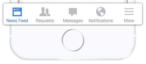
A better alternative is, for example, the now widely used "Tab bar" (illus. 5). It is used by Facebook, Youtube and Twitter, among others. Also other websites like Instagram, Spotify or Apple use this navigation method in their apps. The big advantage is that the most important points can be accessed quickly and clearly at any time. In most cases this is completely sufficient to cover all areas. If more space is needed, a burger menu can still be integrated into this method. This is best placed ergonomically at the bottom of the screen, as smartphones are often used with the thumb.
one of the first bottom tab bar solution from facebook
Conclusion to the Burger Icon
For desktop versions, a hamburger icon should be avoided. To the question, if you should generally not use the burger menu, you cannot answer with a clear yes or no. It depends heavily on a wide range of factors. One of the most important is the general structure of the site. If it is mainly about browsing or scrolling and the most important content is displayed on the main page, a burger menu might be the right choice. But you should be careful if the target group cannot be clearly declared. This may be detrimental to the conversion and usability of the site. This can quickly backfire, as technically inexperienced people may not even understand that this is a menu. As a result, people do not spend as much time on a website as they would like, as they often cannot find the information they are looking for. When using it on mobile devices you should always make sure to combine an icon with a label. Furthermore it should be displayed in a way that it looks clickable to get attention from the user. However, it can be noted that the icon should be used with caution, as it is still a hidden navigation. It forces the user to click again to access the information. At the moment, a combination of tab bar and burger icon works best.
Further Information and Sources ( unfortunately some in German ):
Petereit D. - The Hamburger-Icon: t3n
Bretschneider R. - Top 3 Questions about the burger Menu: usabilityblog
Neil T. - How to enhance the navigation experience on mobile devices: oreilly
Bruce C. - 7 Mobile-Friendly Navigation Best Practices: bruceclay
Last Words
You have finally reached the end. If you enjoyed this post, please share. Thank you for reading my article. I hope you find it interesting and learned something new. You can give me your feedback and suggestions on robinglaeser@gmail.com, or connect with me on LinkedIn. I would be glad.
A like 👍 would mean the world to me!


